
Using the Correct Grades of Pencil: White Phalaenopsis Orchid
- Dianne Sutherland

- Jun 4
- 4 min read
In this post, I explore the tonal drawing of a white Phalaenopsis orchid. White flowers can be especially challenging in both graphite and watercolour, and here I look at how careful selection of pencil grades can create a convincing three‑dimensional form that reads as white through tone alone. I also discuss how to avoid relying on outlines to make up for weak tonal structure.

Pencil Brands Are Not Equal
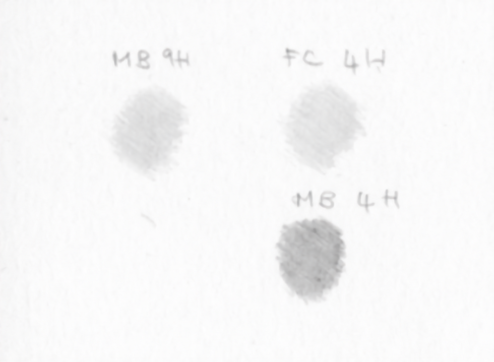
One essential point—often overlooked—is that pencil grades are not standardised across brands. A 4H in one brand may be significantly darker or softer than a 4H in another. The comparison below demonstrates this clearly.
This is why, at the start of the course, you are asked to create tonal strips for the specific brand you use. These strips help you choose the appropriate grade for each stage of a drawing. If I say that I begin a foundation layer with a 4H Faber‑Castell 9000, but you use a different brand, your result may be completely different. So, always refer to your tonal strip and test the pencil first on the same paper before committing to the drawing.
Some brands, such as Derwent, tend to be too soft for botanical work. They are good for loose sketching but they are not ideal for the precision and clean finish required in botanical illustration.
In the example below, you can see that the Faber‑Castell 4H (upper right) is much lighter than the Mitsu-bishi 4H beneath it. The closest match to the FC 4H is actually the Mitsu-bishi 9H (top left).
Why H (Hard) Grades Matter
Understanding pencil grades is crucial for botanical tonal drawing. Botanical illustrations must be precise, clean, and free from smudges or rough edges. Working too quickly or using pencils that are too soft can result in a grainy, uneven finish. That's why tonal drawings of plants take time because they rely on careful layering and controlled application.
To achieve a smooth, refined surface, the foundation layers should be built with hard (H) grades. These create a base that later layers can sit on. White flowers require an even harder range of pencils than darker subjects, but all tonal drawings begin with H grades.
The reason lies in the materials: graphite pencils are made from clay (small particles) and graphite (larger, flatter particles). Hard pencils contain more clay, and these smaller particles fill the tiny indentations in the paper more efficiently, producing a smoother finish. If you skip ahead to softer grades, the larger graphite particles catch on the paper fibres, leaving white specks that are difficult to correct.
You must also work the graphite gently but repeatedly into the paper surface. Skimming over the surface or using a blunt pencil will also create a grainy texture. A sharp point and some patience is essential.
Under magnification, paper fibres reveal an uneven landscape. Clay particles settle into the recesses, while graphite clings to the raised edges—another reason why hard grades are vital for the early stages.

A Tonal Drawing Needs a Lightweight Outline
A tonal drawing should not rely on a strong outline. Instead, form is created entirely through tonal values, giving the subject a three‑dimensional appearance. This means the initial line drawing must be pale enough to disappear into the shading.
I usually create the measured drawing on tracing paper first, then transfer it using either tracing paper or a light pad. For this, I use a hard pencil—such as a 2H Faber‑Castell or a 6–7H Mitsu-bishi. A very light touch is essential to produce a clean, delicate outline with minimal need for erasing. Erasing can damage the paper surface, so use a kneadable eraser only when absolutely necessary. After transferring, you may need to lighten the lines further by gently rolling the eraser over them.

The Importance of Light
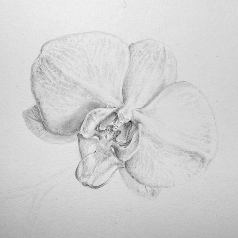
In this drawing, the light falls from the upper front right. I think of the lighting as my most reliable guide, because it creates the shadows that describe the form and lead the drawing. When a white flower is lit well, it reveals a surprising range of tonal values—very little of it is truly white. The light also creates cast shadows that help separate overlapping parts of the flower. In the image, you can see these shadows clearly, giving structure and depth to the bloom.

The Drawing Process
Here are a range of images showing the process during the drawing. The drawing took around 2.5 - 3 hours. The Flower was completer with 9H -2H with Mitsu-bishi High Uni pencils and the stem was completed using 5H to HB Mitsu-bishi pencils


Below is a short video discussing some of the the key points within the drawing. f you wan to find out more, videos will be added to the Additional Graphite Resources page on the Course website, which has videos the process in more detail.


Comments