
Organising the Workspace and Working Out Colours: Dendrobium convolutum Part 4

Unfortunately, the Dendrobium didn’t open its flowers on the main spike in time for the ASBA submission, so I’ll continue the illustration at my leisure - though hopefully not taking too long - and I’ll keep guiding you through my process as I go.
Once the composition was drafted, as shown in my previous post, the first stage of any painting is to organise the workspace and work out the colours that will be used. I chose to make a practice colour study of the whole composition because I felt there might still be changes to make, and I’m not entirely happy with it yet. This is completely normal - deciding on the composition is possibly the most important part of any drawing or painting, and it often takes time to settle.
Organise Your Workspace
It may sound obvious, but the very first practical step is to organise the workspace. Here is a short video of my starting point. I always clean the paints and desk before beginning new work, and I make sure everything I need is within reach. This makes the painting process far more comfortable and helps maintain focus.
Working out the Colours
I work with a limited palette, which you can see below and I highly recommend this approach if you want to gain a solid understanding of your paints and learn how to mix colours accurately. I’ve included my tutorial on colour mixing on the website, so there is plenty of information available to support this part of the painting process.
Working with fewer colours makes it much easier to select the most suitable pigments for a subject. Initially, it can feel more challenging - but do stick with it, as it becomes far easier once you get the hang of it. A limited palette encourages accuracy, confidence, and a deeper understanding of how your paints behave.

Top Row — Yellows
Lemon Yellow Nickel Titanate
Winsor Lemon
Winsor Yellow
Transparent Yellow
Middle Row — Reds
Quinacridone Magenta
Permanent Rose
Quinacridone Red
Scarlet Lake
Permanent Carmine or Permanent Alizarin Crimson
Bottom Row — Blues
Manganese Blue (or Manganese Blue Hue)
Cobalt Blue
Winsor Blue (Green Shade)
French Ultramarine
Indanthrene Blue
In the first video I discuss the colours used initially whilst testing them out - this enables me to establish if the choices are correct, sometimes adjustments need to be made, so don't worry if you don't get it right initially, thats normal and finding the correct colours is a process of trial and error.
Always Work from Live Plant Material
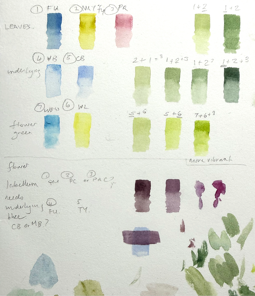
It’s essential to match colours from live plant material, as photographs are often unreliable and can be quite inaccurate. I always begin by identifying the type of leaf I’m working with. In this case, the leaf is quite shiny, so I consider using an underlying blue to create that reflective quality. Leaving a pure white highlight can sometimes make the leaf look as though it has a hole in it, whereas a subtle blue underlayer gives a more natural, vibrant shine as the green interacts with the blue.
The key is subtlety: the blue wash must be very pale and dilute. You can strengthen it later if needed, but the first layer should be gentle enough to sit quietly beneath the greens.
For underlying colours, I usually choose light, dilute washes.
The key is subtlety: the blue wash must be very pale and dilute. You can strengthen it later if needed, but the first layer should be gentle enough to sit quietly beneath the greens.
For underlying colours, I usually choose light, dilute washes.
Cobalt Blue is often a very good option.
Sometimes I mix Cobalt Blue with Manganese Blue to create a brighter, slightly warmer blue when the leaf surface calls for it.
This approach helps establish depth, luminosity, and realism right from the first wash.
The Basic Hue
The basic hue is the predominant green of the leaf, but it’s important to remember that this hue contains many subtle variations — shifting from cooler to warmer greens, and from very dilute washes to more saturated applications of colour, with lighter and darker versions of the colours. Observing these nuances is key to achieving a naturalistic result.
This leaf is a mid to dark green, so French Ultramarine is the natural starting point for me. Although French Ultramarine is a granulating pigment, this isn’t noticeable when a moderate amount of water is used. Granulation only becomes visible in very wet washes, and much of the colour in this leaf will be applied in relatively thin or dry layers — so it’s not an issue here.
To mix the green, I chose to add Transparent Yellow, which is a strong yellow, with just a tiny amount of Permanent Rose added to create a more naturalistic green. The amount of red added to a green mix must be extremely small — too much will dull or shift the colour, and the hue will no longer be correct.
This combination gives a flexible, realistic green that can be adjusted warmer or cooler depending on the part of the leaf being painted. I can also mix the stem colours ffro tne samer colours.
The Flower Colours
I also made preliminary colour studies for the flowers. The outer petals and sepals are a light, bright green, so they require a different combination of blues and yellows from those used for the leaves and stems.
Initially, I tried Cobalt Blue, but it wasn’t vivid enough for the intensity of these petal tips. Instead, I chose Winsor Blue (Green Shade). This is an extremely intense, highly saturated blue, so it must be used with great care - only a very small amount is needed.
To create the bright green, I mixed Winsor Blue (Green Shade) with Winsor Lemon, which produces a clean, vivid green. I then added a touch of Permanent Rose to make the colour more naturalistic. As always, the amount of red must be tiny; too much will shift the hue and dull the green.
You can see these mixes in the colour chart above.

The labellum is a particularly challenging part of the Dendrobium to paint because the colour is dark, extremely shiny, and full of red–purple undertones. This complexity is almost impossible to capture accurately from a photograph, which is why working from live plant material is essential.
To create the shine, I will begin with a light underlying wash of either Cobalt Blue or French Ultramarine. I will est both colours to see which gives the most natural reflective quality. This underlying blue must be very pale - just enough to establish the sheen without overwhelming the later layers.
For the main colour, I use Permanent Carmine, or Permanent Alizarin Crimson mixed with French Ultramarine to create the deeper purples, I may also introduce Quinacridone Magenta in some areas but will need to experiment on the flower. A tiny amount of Transparent Yellow helps to keep the colour natural and prevents it from becoming too cold or too blue leaning but also makes it very dark. The mix for this type of colour needs to be very creamy and not watery or it will not work. The reds will form the essential base layer, and the darkest colour will be dry brushed on top to create the rich, velvety depth of the labellum. I made an additional colour chart with these colours.

At this stage, I can begin trying out all of the colours and techniques to check that they work together. This testing phase is the next step in the process and will take place on the study page, where adjustments can be made before committing to the final painting.

The story will be continued in the nex post

Comments